In this interview, BMA Exhibition Designer David Zimmerman shares his experience transforming the galleries to present the 235 works on view in Making Her Mark: A History of Women Artists in Europe, 1400-1800.
My name is David Zimmerman and I am the Exhibition Designer for the BMA. I am responsible for the physical design of the galleries, including layout of temporary walls, styles of casework, paint and fabric selections, and arrangement of artworks. I work directly with curators to ensure these elements align with the themes and narratives they want to communicate.
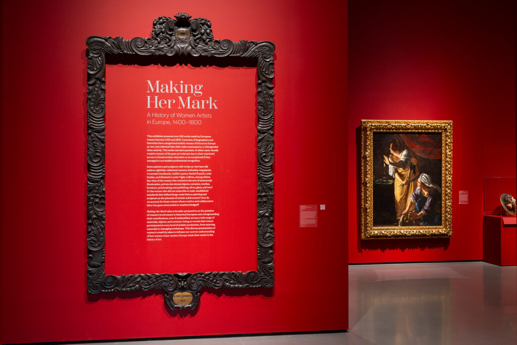
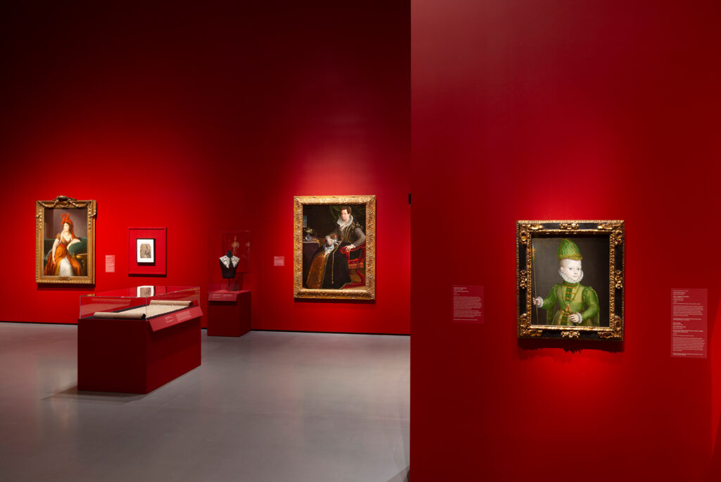
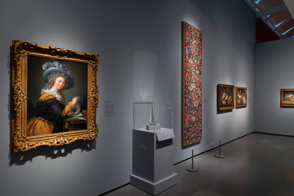
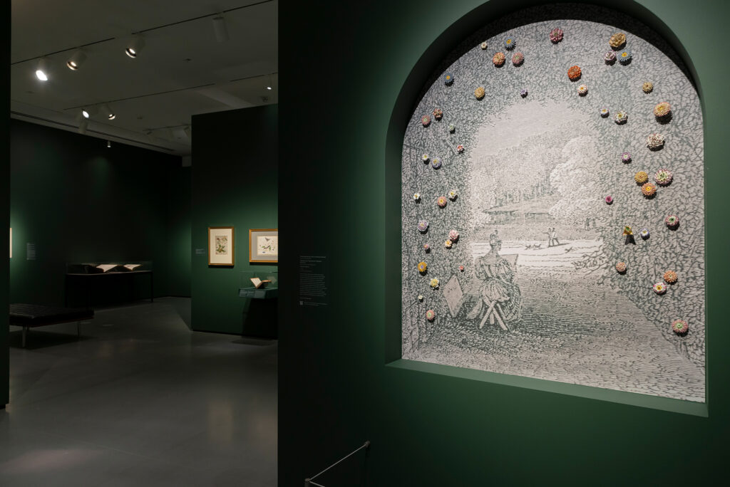
What are some factors that contributed to the Making Her Mark exhibition design?
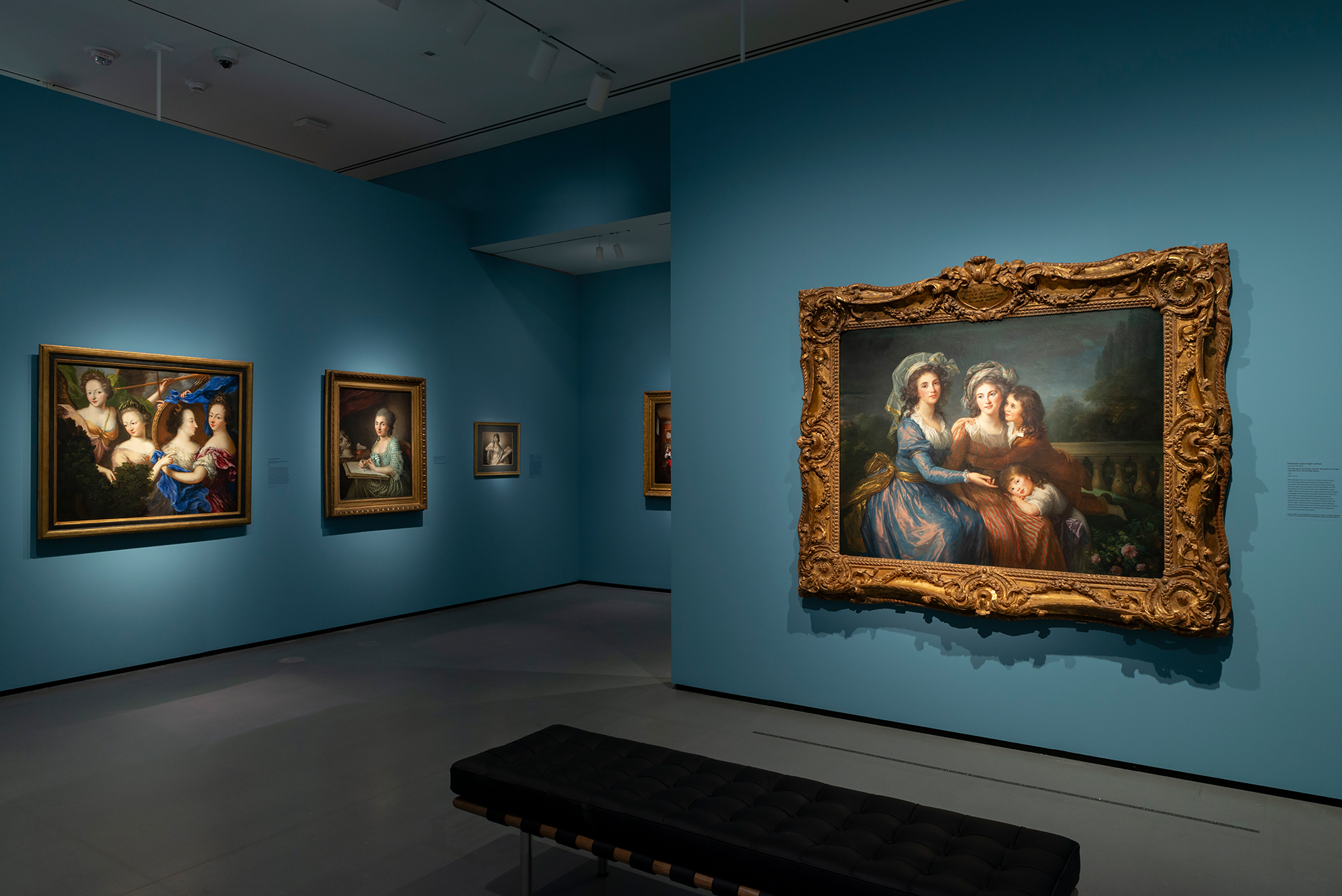
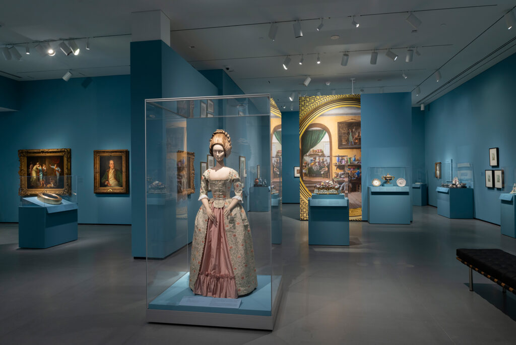
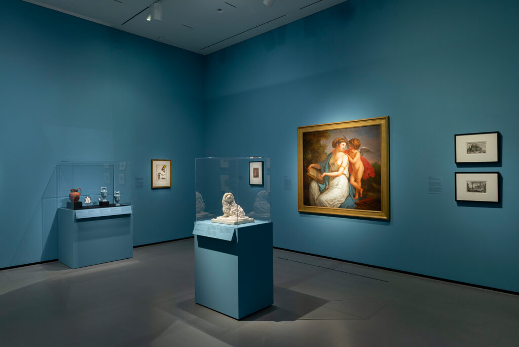
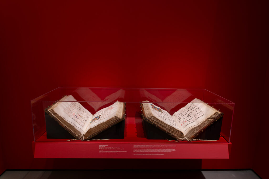
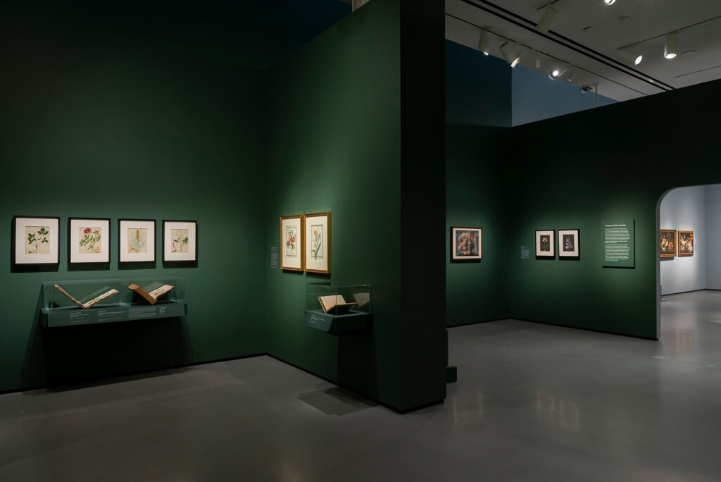
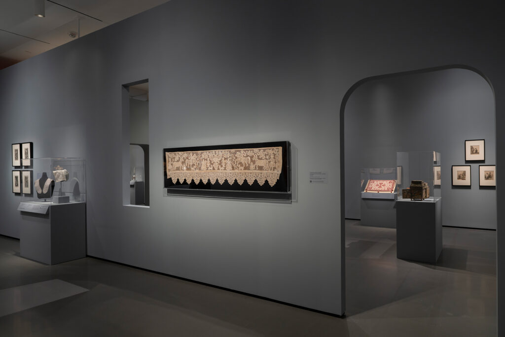
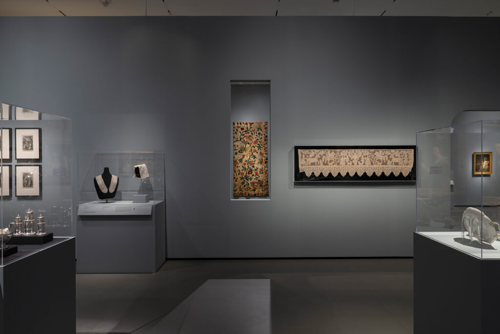
I would say the biggest considerations for this exhibition were the volume of objects we wanted to display as well as the variety. We had to make more rooms and more walls to fit everything. Rather than opting for large, sprawling gallery spaces, we made a room for each section. This let us maximize wall space and control visitor flow through the exhibition. Several of the books on display were either too large or too small to fit nicely into our standard book casework, so we made cantilever cases that they would fit in more specifically. This also allowed us to install framed artworks above them when we needed to take advantage of the wall space.
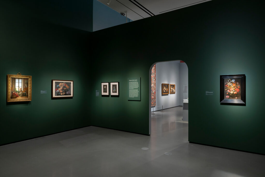
Textiles, books, and other works on paper require limited exposure to lighting as a conservation measure. The lower light levels throughout the exhibition reflect this, but it also helps create a sense of drama, especially in the first few galleries.
What are some new exhibition design features created for Making Her Mark?
The cantilevered cases aren’t necessarily new, but we’ve generally used cases like this for ephemera or non-art objects. Using them for books in Making Her Mark gave us a lot of flexibility in placement and allowed us to conserve much needed space. These cases are also more accessible than our standard floor cases, allowing wheelchair users to have a closer look. I worked with our fabrication team in the Installation department to ensure these cases would be sturdy and secure enough to hold artworks.
What motivated the curved archways and window details featured in the galleries?
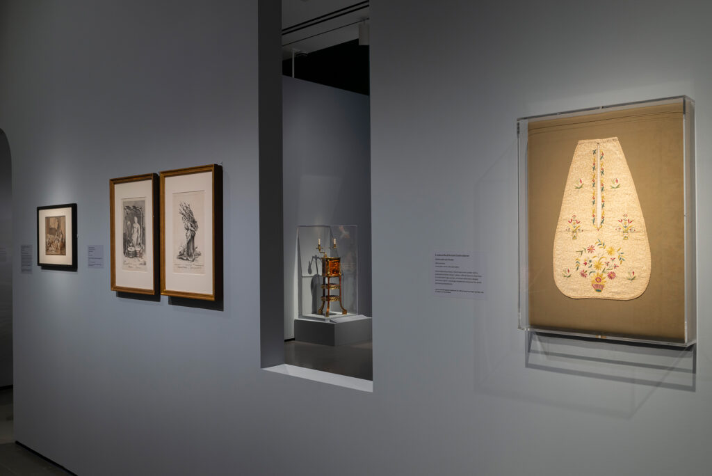
The curved doorways in the exhibition’s Interiority sections were a reference to the home, as these artworks would have been seen or used in domestic settings. These door openings are smaller and have a lower clearance—an architectural feature that you would find in a home. The window in this section creates a sightline to a tapestry in the adjacent space that provides a long view of these larger pieces.
Can you describe the process of exhibition design, from creating a design plan to building and installation?
Leading up to building and installation, the layout goes through many iterations. The first thing we do is create a space assessment, scaling the artworks on the checklist with 3D modeling software and placing them in the gallery according to section. With this space assessment, we can determine where walls need to be built and where casework can be located throughout. We’ll see if any area feels too dense, and I work with the curator to shift things as needed. In laying out the exhibition, we need to consider how the visitor will navigate the galleries, and where to place seating while ensuring object safety and appropriate touch distances or barriers.
A lot of the casework for this exhibition needed to be vetted by the lending institutions. Some museums require the use of specific materials, spacing, or security apparatus in the cases, so these requirements get incorporated into our casework.
We chose the paint colors for Making Her Mark by drawing inspiration from the exhibition’s themes and artworks. During installation, we finally see the works together and sometimes need to adjust the layout. Typically, this is just a matter of changing the order of a group of works or changing the spacing. This is our last chance to make changes before the works are installed and secured in their final placements.
What feature of the Making Her Mark exhibition design are you most proud of?
As far as number of objects, this is the largest exhibition I’ve worked on, including my time as a Preparator (Art Handler). I am most proud of the pacing and visitor flow. For friends and family that I’ve brought to the Museum, they want to stick around and see everything. That says a lot about the selection of works, their interesting stories, and how the galleries have been transformed to support them.
Get tickets to Making Her Mark: A History of Women Artists in Europe, 1400-1800, on view through January 7 at the Baltimore Museum of Art.


